We began our exploration by studying Wolfgang Weingart’s work and Ellen Lupton’s design principles. Our main focus was to extract design qualities and principles that would help guide our design decisions when defining a direction for our expressive microsite.
Using the stated design directions and principles, we created three unique directions

For our first approach, we utilized the combination of ‘using a dominant shape to anchor elements’ along with ‘using image ambiguity through color manipulation and distressed texture’


For our second approach, we delved into the usage of the golden ratio within a modular grid to strategically place and frame parts of an image until it revealed the whole composition of the image


For our third approach, we utilized the combination of ‘using a dominant shape to anchor elements’ along with ‘using image ambiguity through color manipulation and distressed texture’


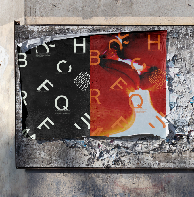


Ultimately, we chose the third direction as our final design direction as we felt it had the most flexibility and adaptability when applied to other mediums, developing a versatile visual identity. Therefore, we went ahead with this direction to translate the graphic experimentation posters into an expressive microsite
I was in charge of creating the interactions and animations for both the ‘transitioning to the homepage’ as well as the ‘legacy performances’ section.
We determined that by creating an intervention point at the pre-visit, promotional, and pre-purchase stages, we would leverage the appeal of Amsterdam Sinfonietta to be viewed as a highly anticipated event. This would help boost the appeal of attending in person as well as highlight previous performances.

We establish the idea of exploring and revealing on the landing page, through introduction of the animated square cursor.

Taking the user through a gallery-walk type experience of the Bosch Requiem history, reinforcing the user’s ability to use their cursor as a guide and to reveal elements.

Arriving in the legacy section, the user is greeted with video thumbnails of past performances arranged in a timeline that overflows beyond the screen, prompting a user to see the whole timeline and the content which lays within each year.

Each performer is highlighted in their own section, where the next performer can be accessed after a user uncovers the image. A thumbnail of the previous performer is then stored on the side for quick access.

Simplifying down the key interactions and responses from the main site maintains visual consistency for the user while providing an easy ticket purchasing experience.

Creating the initial concepts for the posters that were given to the top 3 winning teams by developing the foundational layout, typography, and visual style, ensuring alignment with the event's branding.
10 Months
(MAY. 2023 - FEB. 2024)
Visual Designer